
ILLUSTRATIVE CONCEPT / CASE STUDY
OFF HOURS
Coffee for the
in-between.
A daily ritual.
A different rhythm.
01 / THE BRIEF
Imagine a small coffee brand for the moments between meetings, plans and everything else. The brief for this concept: make the everyday coffee break feel like time well spent.
02 / THE IDEA
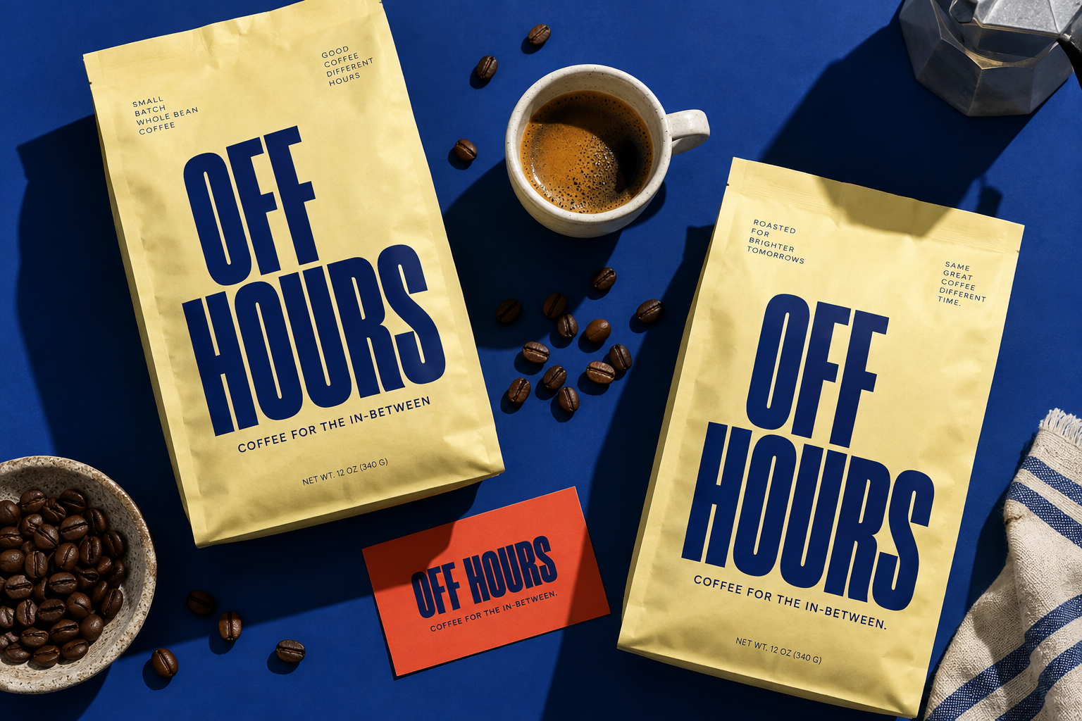
Pair a straightforward name with oversized, confident typography. Cobalt blue and butter yellow give the identity a recognisable contrast, while short lines of copy keep the tone easy and human.
03 / WHAT TAKES SHAPE
A packaging-led visual direction, with a wordmark, colour palette and graphic approach designed to extend across cups, cards and digital touchpoints.
TAKE
YOUR
TIME.
Cobalt, butter yellow and a little warmth.
The direction.
This illustrative direction shows how a simple idea can connect packaging, language and brand expression. A real case study would add the finished deliverables, client feedback and verified outcomes here.