
ILLUSTRATIVE CONCEPT / CASE STUDY
SIDE NOTE
Live a little
louder.
Worth a look.
Worth a listen.
01 / THE BRIEF
Imagine an independent arts and music event with plenty of character and a small communications budget. This concept explores how to make its presence felt before anyone reaches the door.
02 / THE IDEA
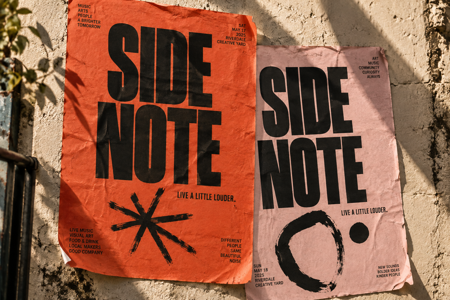
Treat the city as the first stage. Big type, warm colour and expressive marks give the campaign a direct, unpolished energy that can carry from a street poster to a social post.
03 / WHAT TAKES SHAPE
A poster-led campaign direction, an expressive typographic approach and a flexible colour pairing for an event with something to say.
LIVE A
LITTLE
LOUDER.
Warm orange, pale pink and black ink.
The direction.
This illustrative study demonstrates a campaign identity with a clear voice and room to adapt. A published client case study would include actual rollout imagery and measured results when available.